BACK
Representing data
Once
a research question has been developed, we collect data. The next step
is to classify and organise the data. This is then followed by
summarizing the data using the measures of central tendency and spread.
More importantly the data that has been collected, classified, organised
and summarised needs to be represented and interpreted graphically. The
following different types of graphical representations will be
explained in this section: pie charts, histograms, single bar graphs,
line graphs and broken line graphs.
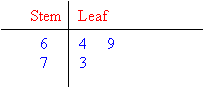
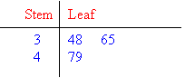
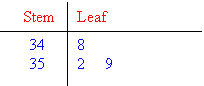
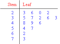
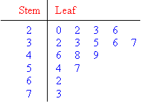
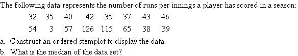
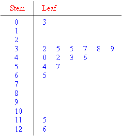
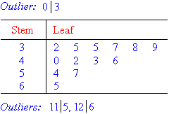
Stem & Leaf
In this section, we will consider the stemplot (or stem-and-leaf plot) which can be used to arrange, analyse and
interpret numerical data.
A stemplot is a device used to group a small data set (up to
about 50 data values). It arranges the data set in ascending order
while retaining all the original data values. This enables us to
find the first quartile, median and the third quartile readily. The
stemplot is useful to obtain information about the centre, spread, shape
and outliers of the distribution. |


Foot length
|
Frequency
|
22 - 23,9 cm
|
3
|
24 - 25,9 cm
|
10
|
26 - 27,9 cm
|
8
|
28 cm and longer
|
4
|
We can represent this information on a histogram as follows:

Notice that unlike in the bar graph in the
previous section, in the histogram, the bars are drawn next to each
other - there are no spaces between them. This is to indicate that the
data is continuous.
Example 1: Drawing bar graphs and histograms
Question
-
The school tuckshop keeps track of how many hot dogs, sandwiches,
salads and burgers they sell at one break time. They have the data
given in the table below. Draw a bar graph to represent this data.
ItemFrequencyHot dogs15Sandwiches35Salads10Burgers12
- Lwanda
measures the length of his school books (in cm) and draws up the
frequency table below. Draw a histogram to represent this data.
Length of BookFrequency20 - 23,9 cm424 - 26,9 cm727 - 29,9 cm5Longer than 30 cm3
Answer


Note from the previous worked example that
when we draw both bar graphs and histograms, it is important to use an
appropriate interval for the vertical axis. For example, using an
interval of 100 would not be appropriate if our largest frequency is
only 15, and using an interval of 1 would not be appropriate if we had a
maximum frequency of 500 - it would make our graph very large and hard
to read!
Line graphs
In
data handling we use line graphs to show the relationship between two
quantities. The horizontal axis often represents time, as these kinds of
graphs are particularly useful for showing changes over time.
For
example, we can plot the manner in which the temperature of water in a
pot being heated, increases, where the temperature is taken every 30
seconds.

Time (30 second intervals)
|
0
|
30
|
60
|
90
|
Temperature (°C)
|
20
|
40
|
60
|
80
|

Example 2: Representing data on a line graph
Question
This table below shows the average number of minutes that Jabu spent watching TV from January to November last year.
Month
|
Jan
|
Feb
|
Mar
|
Apr
|
May
|
Jun
|
Jul
|
Aug
|
Sep
|
Oct
|
Nov
|
Daily TV viewing time (min)
|
108
|
103
|
108
|
120
|
115
|
122
|
116
|
105
|
110
|
105
|
104
|

- Plot this data on a set of axes.
- Can you observe any trends or patterns in the data? Give some possible reasons for these trends.
- Would you be able to represent this data in a bar graph?
- What is the advantage of using a line graph to show this information?
Answer
- The points are plotted and connected with line segments.

- You can see that Jabu's viewing time increases in April and again in June and slightly in September (perhaps due to school holidays). We also see decreases in his viewing time during February, May, August, October and November. These could be times when he was preparing for tests and exams.
- Yes, it would be possible to represent this data in a bar graph; the number of minutes would be plotted as a bar for each month.
- A line graph helps us to see trends because we can easily see the increasing or decreasing slope of each line segment in the graph.
Exercise 2: Representing data
There
are 300 learners at a school sports day. There are four sports teams,
represented by red, blue, green and yellow. Someone records the colours
of the T-shirts the learners are wearing.
Colour of T-shirt
|
Red
|
Blue
|
Green
|
Yellow
|
Frequency
|
75
|
93
|
78
|
54
|
Represent this data in a pie chart.

The following list gives the weights of the learners in a class in kilograms.
64; 83; 74; 77; 65; 55; 58; 61; 63; 98; 97; 53; 54; 102; 78; 82; 86; 95; 67; 72
-
Draw a frequency table to order the data, grouping it into 10 kg intervals.
-
Use the frequency table to draw a histogram of the data.
- Interval (in kg)Frequency50 - 59460 - 69570 - 79480 - 89390 - 993100 - 1091
- Media File:

The following table gives the maximum temperature (in °C) for each month in a year.
Month
|
Jan
|
Feb
|
Mar
|
Apr
|
May
|
Jun
|
Jul
|
Aug
|
Sep
|
Oct
|
Nov
|
Dec
|
Max Temp (°C)
|
27
|
28
|
25
|
21
|
20
|
17
|
18
|
19
|
20
|
24
|
25
|
27
|
-
Draw a line graph of this data.
-
Describe the trends you see in the data.
- Media File:

- The maximum temperature drops towards the middle of the year, as we would expect during winter.
Answer
the questions below about the following pie chart. The pie chart shows
the favourite fruit juice flavours of a group of 120 learners.

-
Calculate how many learners chose each type of juice.
-
In what way does the pie chart work better than a bar graph to represent this data?
-
What information would a bar graph give you that this pie chart does not?
- 45% of 120 learners = 54 learners who chose fruit cocktail. 30% of 120 = 36 learners who chose litchi. 12,5% of 120 learners = 15 learners who chose grape. 12,5% of 120 = 15 learners who chose apple juice.
- The pie chart is a simple, visual representation that works well for representing percentages. A pie chart allows us to see at a glance the relative proportions of the learners who prefer each flavour.
- The number of learners who prefer each flavour.
Look at the bar graph below and answer the questions that follow.

-
Does this graph tell us how many Grade 10 learners there are in total?
-
Can we assume that none of the learners who take Accounting take Geography?
-
A pie graph of this data would not make sense. Explain why.
- No. It may look like there are 140 learners in total but we have no way of knowing if that is correct or just an arbitrary number. Also, learners take more than one subject, so we can't use the numbers of learners per subject to determine how many learners there are altogether.
- No, we cannot assume this.
- Learners do not only take one subject, therefore the data cannot be split into discrete percentages per subject and represented using a pie chart.
i like this topic. it is fun and very easy.
ReplyDelete